Sabroso’s Mexican Restaurant
Student Silver Addy Award – AAF Lubbock, 2020
Sabroso’s is a casual experience with fine dining elements to heighten the experience for the guests. The name is derived from the Spanish word ‘sabroso’ meaning tasty in English. Playful typography and abstract symbolism drawn from traditional Mexican culture was my solution to creating a logo and brand for this restaurant. Project includes a stationery system, lunch and dinner menus, and tequila bottle designs.


Traditional Mexican dance was one of the inspirations for the unique and organic ‘O’ in the wordmark for Sabroso’s. (Photo credit unknown.)

Utilized the logo for the different labels on tequila bottles.


The inverted exclamation points reflect Spanish heritage and excitement for the food.
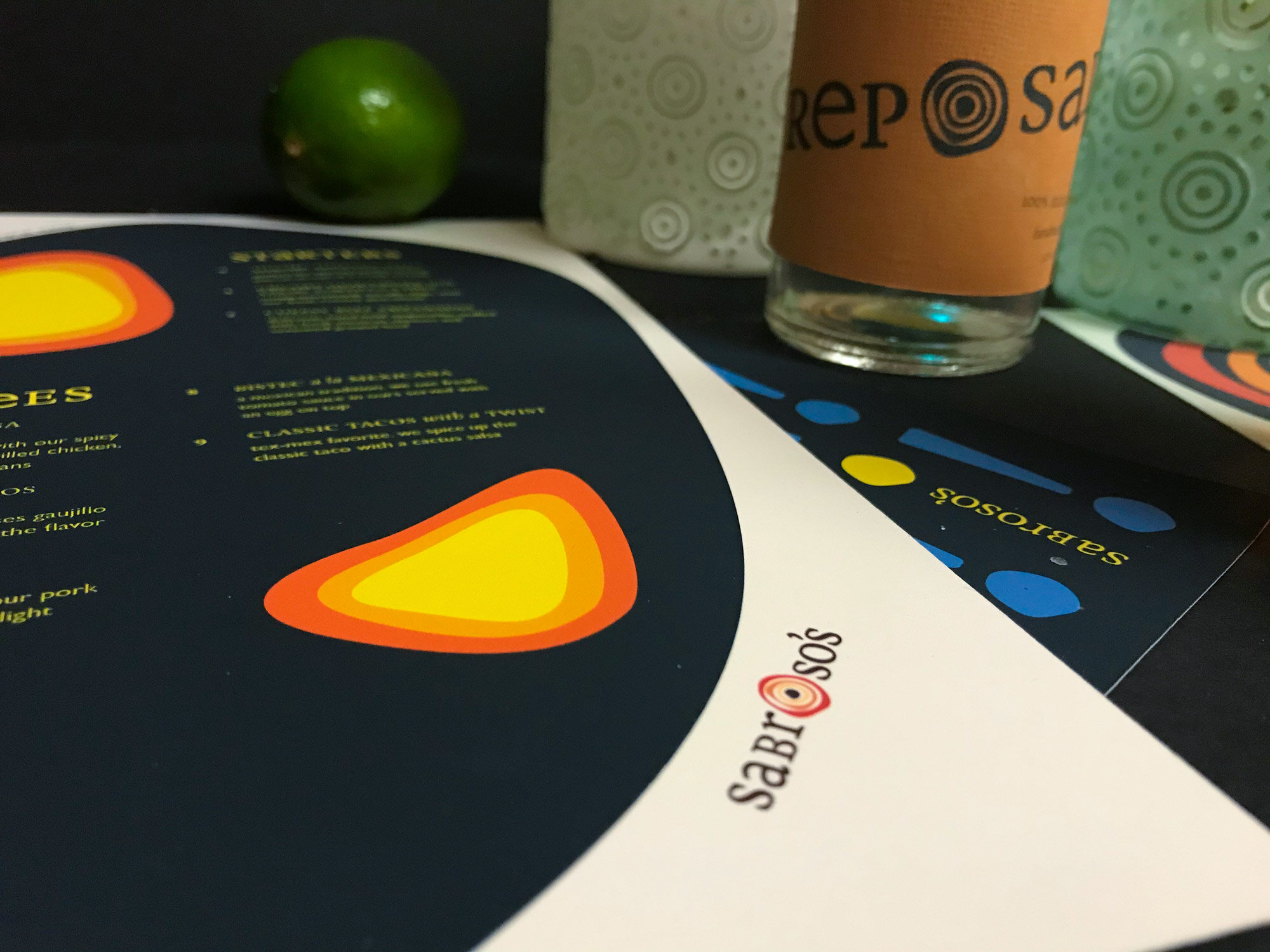
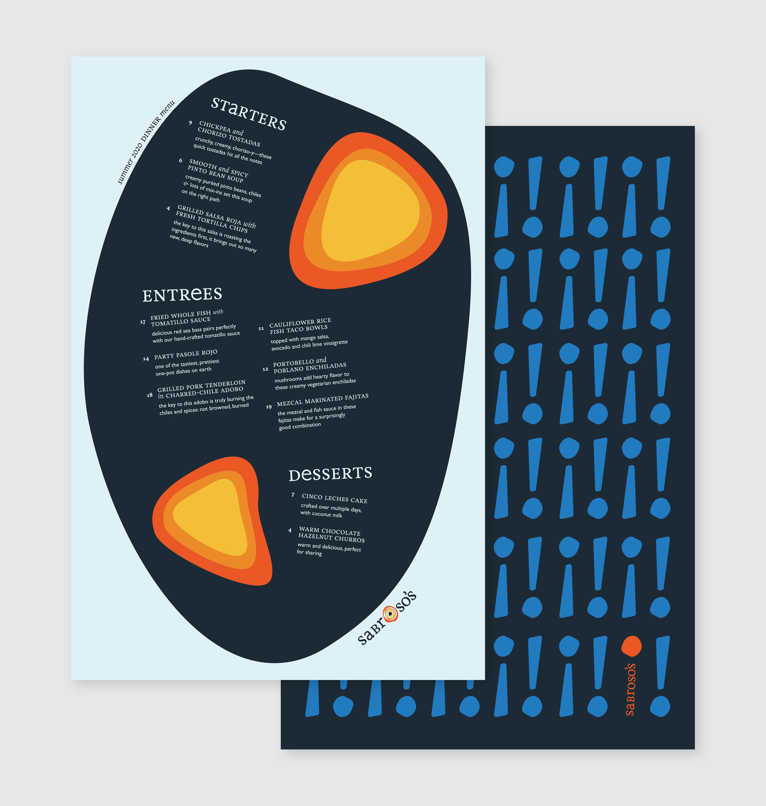

The logo and stationery use two different fonts — Livory Regular and Gill Sans Book — to reflect eclecticism and playfulness.
Designer: Chase Pickering
Photography: Chase Pickering
Professor: Carla Tedeschi
Texas Tech University